Do you want to grow your real estate online marketing strategy and generate more leads? You need to consider many factors. And one of your top priorities should be creating a great website design. But what goes into a good website design? Functionality, visual appeal, consistency, and imagery are a few elements. To get a better sense of a high-quality real estate website design, let’s examine a few theme examples.
One of our favourite real estate website themes is Listio. The design is very simple and easy to use. It showcases many property listings on one page, which makes it easy for buyers to scroll through. The icons also show essential information including address, number of bathrooms, and bedrooms. It also shows how long listings have been on the market and square feet.
Visitors can search through photos and examine properties without leaving the home page. This theme is ideal for buyers who want to search through many listings without opening new tabs. The layout makes it fast and easy for users to get information. Buyers can also save the listings they like into their favourites to examine later. To do this, they need to fill out their name, contact information, and role in the real estate process. This is the perfect way to build your email marketing list and separate users into segments.
Villa is another theme we recommend for agent websites. If you want to generate more real estate leads, you need to promote your business. Villa enables you to advertise your branding and social media handles at the top of your website. They're clear and visible for visitors to see. The pages are designed to make online sharing easy. It’s the perfect theme to build your brand and expand your network. Villa also makes it easy for visitors to contact you, which may increase your real estate leads.
Razor is slightly different from the previous themes. The design is bolder and more structured than the others and has a boxy and professional appeal. The website is easy to use and navigate to find what you’re searching for. The design is clean and minimalist to emphasize images and text. You can create strong CTAs that are bold and visible to drive users to take action and convert them into leads.
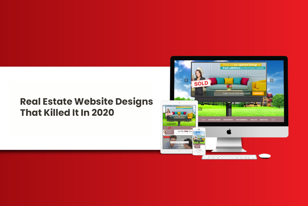
Billboard is another great theme for your real estate website. Unlike the others which focus on professionalism and minimalism, this theme thrives in creativity. The billboard design makes the website very fun and original. If you want to create a strong presence that differentiates you from others, go with a theme like this. Visitors may find your theme refreshing and feel more positively towards your business. The social media handles are also bright and clear for users to click on.


Leave a comment